Pair comparison charts
daspi.plotlib.precast.PairComparisonCharts(source, target, feature, identity, stretch_figsize=False)
Bases: JointChart
Provides a set of charts for visualizing the pairwise comparison of two variables.
| PARAMETER | DESCRIPTION |
|---|---|
source
|
The source data.
TYPE:
|
target
|
The target variable(s).
TYPE:
|
feature
|
The feature variable(s).
TYPE:
|
identity
|
Column name containing identities of each sample, must occur once for each measurement.
TYPE:
|
stretch_figsize
|
If True, the height and width of the figure are stretched based on the number rows and columns in the axes grid. If a float is provided, the figure size is stretched by the given factor. If a tuple of two floats is provided, the figure size is stretched by the given factors for the x and y axis, respectively. by default False.
TYPE:
|
Examples:
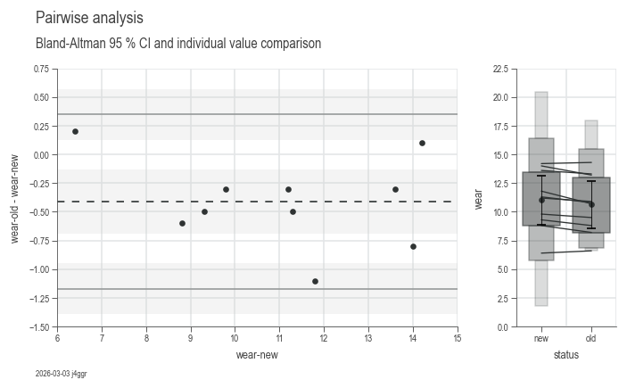
import daspi as dsp

df = dsp.load_dataset('shoe-sole')
chart = dsp.PairComparisonCharts(
        source=df,
        target='wear',
        feature='status',
        identity='tester'
    ).plot(
    ).label(
        info=True
    )
identity = identity
instance-attribute
Column name containing identities of each sample.
plot()
Generates a set of two charts for visualizing the difference between each pair. - BlandAltman where the difference is shown on the y-axis - ParallelCoordinate including a MeanTest and QuantileBoxes plot, to reflect the difference within the absolute values.
| RETURNS | DESCRIPTION |
|---|---|
Self
|
The
TYPE:
|
label(info=False, **kwds)
Adds titles and labels to the charts generated by the
plot() method.
| PARAMETER | DESCRIPTION |
|---|---|
info
|
If
TYPE:
|
**kwds
|
Additional keyword arguments to be passed to the
DEFAULT:
|
| RETURNS | DESCRIPTION |
|---|---|
Self
|
The |