Parameter relevance charts
daspi.plotlib.precast.ParameterRelevanceCharts(linear_model, drop_intercept=True, stretch_figsize=False)
Bases: JointChart
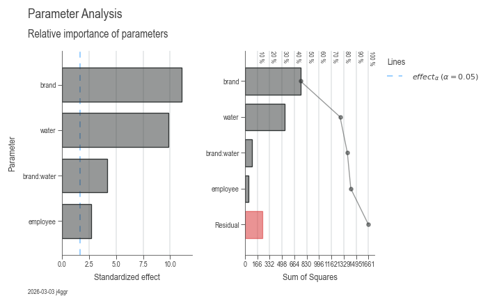
Provides a set of charts for visualizing the relevance of a linear regression model's parameters.
The ParameterRelevanceCharts class takes a LinearModel instance
and generates a set of two charts for visualizing the relevance
of the model's parameters:
- Pareto chart of the parameter standardized effects
- Pareto chart of the Sum of Squares for each parameter
On the first chart, the standardized effect of each parameter is visualized as a Pareto chart. The red line indicates the alpha level of significance.
| PARAMETER | DESCRIPTION |
|---|---|
linear_model
|
The linear regression model whose parameters will be visualized.
TYPE:
|
drop_intercept
|
Whether to drop the intercept from the model, by default True.
TYPE:
|
stretch_figsize
|
If True, the height and width of the figure are stretched based on the number rows and columns in the axes grid. If a float is provided, the figure size is stretched by the given factor. If a tuple of two floats is provided, the figure size is stretched by the given factors for the x and y axis, respectively. by default False.
TYPE:
|
Examples:
import daspi as dsp
import pandas as pd

df = dsp.load_dataset('painkillers-dissolution')
model = dsp.LinearModel(
    source=df,
    target='dissolution',
    features=['employee', 'stirrer', 'brand', 'catalyst', 'water'],
    covariates=['temperature', 'preparation'],
    order=2)
df_gof = pd.concat(model.recursive_elimination())
dsp.ParameterRelevanceCharts(model).plot().stripes().label(info=True)
lm = linear_model
instance-attribute
The linear regression model whose parameters are visualized.
plot()
Generates a set of two charts for visualizing the relevance of the model's parameters: - Pareto chart of the parameter standardized effects - Pareto chart of the Sum of Squares for each parameter
| RETURNS | DESCRIPTION |
|---|---|
Self
|
The
TYPE:
|
Notes
The plot() method will generate two charts. The first chart
will contain the Pareto chart of the parameter standardized
effects. The second chart will contain the Pareto chart of the
Sum of Squares for each parameter.
The red line in the Pareto charts represents the threshold for the effect of a parameter. The threshold is calculated as the alpha risk where the parameter is not relevant.
stripes()
Adds a line at position 0 for each subplot except for the probability plot. This line represents the fit of the model.
label(info=False, **kwds)
Adds titles and labels to the charts generated by the
plot() method.
| PARAMETER | DESCRIPTION |
|---|---|
info
|
If
TYPE:
|
**kwds
|
Additional keyword arguments to be passed to the
DEFAULT:
|
| RETURNS | DESCRIPTION |
|---|---|
Self
|
The |