Workflow 3: Statistical Process Control (SPC)
Statistical Process Control monitors process stability over time using control charts. This is essential for maintaining process improvements, detecting shifts early, and ensuring consistent quality.
When to Use This Workflow
- ✅ Process monitoring: Track stability after improvement (DMAIC Control phase)
- ✅ Early detection: Identify out-of-control conditions before defects occur
- ✅ Trend analysis: Spot gradual process drift or degradation
- ✅ Validation: Demonstrate sustained process control to customers/auditors
Quick Start (15 Lines)
import daspi as dsp

# Load time-series process data
df = dsp.load_dataset("grnr_spc")

# Create control chart
chart = dsp.SingleChart(
    source=df,
    target="result",
    feature="measurement_order"
).plot(
    dsp.Scatter
).stripes(
    mean=True,
    control_limits=True,
    spec_limits=dsp.SpecLimits(lower=2.0, upper=4.5),
    agreement=3  # 3-sigma limits
).label(
    fig_title="SPC Chart: Process Monitoring",
    sub_title="Control limits at ±3σ",
    info=True
)
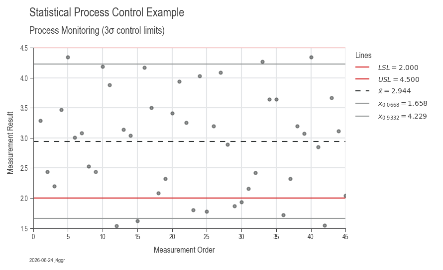 Example output: Control chart with center line, UCL/LCL at ±3σ, and specification limits
What You Get
The control chart includes:
- Data points: Individual measurements over time
- Center line (CL): Process mean (green)
- Upper Control Limit (UCL): Mean + 3σ (red dashed)
- Lower Control Limit (LCL): Mean - 3σ (red dashed)
- Specification limits: Customer requirements (if provided)
- Confidence bands: Optional shading for statistical limits
Automatic interpretation: - Points outside control limits (special cause variation) - Trends and patterns (Western Electric rules) - Process capability vs specifications - Timestamp and statistical summary
Understanding Control Charts
Control Limits vs Specification Limits
Control Limits (UCL/LCL): - Based on actual process variation (voice of the process) - Calculated as: Mean ± 3σ - Indicate statistical stability - Inside limits: Common cause variation (random, inherent) - Outside limits: Special cause variation (assignable, investigate)
Specification Limits (USL/LSL): - Based on customer requirements (voice of the customer) - Engineering/quality standards - Indicate acceptability - Inside limits: Acceptable product - Outside limits: Defect (scrap or rework)
Ideal situation: Control limits well inside specification limits (capable + stable)
Real-World Example: Manufacturing Monitoring
import daspi as dsp

# Load ongoing process measurements
df = dsp.load_dataset("grnr_spc")

# Define specification limits from drawing
spec_limits = dsp.SpecLimits(lower=2.0, upper=4.5)

# Create comprehensive SPC chart
chart = dsp.SingleChart(
    source=df,
    target="result",
    feature="measurement_order",
).plot(
    dsp.Scatter,
    color='steelblue',
    s=40
).stripes(
    mean=True,                  # Show process mean
    median=False,               # Not needed for SPC
    control_limits=True,        # UCL/LCL at ±3σ
    spec_limits=spec_limits,    # Customer requirements
    confidence=0.997,           # 3-sigma = 99.7% confidence
    strategy='norm',            # Assume normal distribution
    agreement=3                 # 3-sigma control limits
).label(
    fig_title="Process Monitoring SPC Chart",
    sub_title="Production monitoring (3σ control limits)",
    feature_label="Measurement Order",
    target_label="Measurement Result",
    info=True
)

chart.save("spc_monitoring.png")
chart.show()
Control Chart Types
Individuals Chart (X-chart)
Use when: One measurement per subgroup, continuous data
chart = dsp.SingleChart(
    source=df,
    target="measurement",
    feature="time"
).plot(dsp.Scatter).stripes(
    mean=True,
    control_limits=True,
    agreement=3
)
X-bar and R Chart (Subgroups)
Use when: Multiple measurements per subgroup
# Calculate subgroup means and ranges
df_grouped = df.groupby('subgroup').agg({
    'measurement': ['mean', lambda x: x.max() - x.min()]
})
df_grouped.columns = ['xbar', 'range']

# X-bar chart
dsp.SingleChart(
    source=df_grouped,
    target="xbar",
    feature=df_grouped.index
).plot(dsp.Scatter).stripes(
    mean=True,
    control_limits=True
).label(title="X-bar Chart")

# R chart
dsp.SingleChart(
    source=df_grouped,
    target="range",
    feature=df_grouped.index
).plot(dsp.Scatter).stripes(
    mean=True,
    control_limits=True
).label(title="R Chart")
Comparison Across Groups
Use when: Monitoring multiple machines, shifts, or operators
# Compare performance across production lines
chart = dsp.MultivariateChart(
    source=df,
    target="measurement",
    feature="time",
    col="machine",  # Separate chart per machine
).plot(
    dsp.Scatter
).stripes(
    mean=True,
    control_limits=True,
    spec_limits=spec_limits
).label(
    fig_title="Multi-Machine SPC Monitoring",
    col_title="Machine ID"
)
Detecting Out-of-Control Conditions
Western Electric Rules
- Rule 1: One point beyond 3σ
-
Action: Investigate immediately, likely special cause
-
Rule 2: 2 out of 3 consecutive points beyond 2σ (same side)
-
Action: Possible process shift
-
Rule 3: 4 out of 5 consecutive points beyond 1σ (same side)
-
Action: Process trending
-
Rule 4: 8+ consecutive points on same side of center line
-
Action: Process shift or stratification
-
Rule 5: 6+ consecutive points steadily increasing/decreasing
-
Action: Trend (tool wear, temperature drift)
-
Rule 6: 14+ consecutive points alternating up/down
- Action: Systematic variation (two alternating sources)
Implementation in DaSPi
# Manually check rules (automated detection coming soon)
import numpy as np

mean = df['measurement'].mean()
std = df['measurement'].std()

ucl = mean + 3 * std
lcl = mean - 3 * std

# Rule 1: Points beyond 3-sigma
outliers = df[(df['measurement'] > ucl) | (df['measurement'] < lcl)]
if len(outliers) > 0:
    print(f"⚠️ Rule 1 violation at samples: {outliers.index.tolist()}")

# Rule 4: 8 consecutive points on same side
above_mean = (df['measurement'] > mean).astype(int)
consecutive = (above_mean.diff() == 0).sum()
if consecutive >= 8:
    print(f"⚠️ Rule 4 violation: {consecutive} consecutive points on same side")
Advanced Control Chart Features
Custom Sigma Levels
# 2-sigma limits (more sensitive, more false alarms)
chart.stripes(
    control_limits=True,
    agreement=2
)

# 6-sigma limits (less sensitive, fewer false alarms)
chart.stripes(
    control_limits=True,
    agreement=6
)
Alternative Distribution Strategies
# Auto-fit best distribution
chart.stripes(
    control_limits=True,
    strategy='fit',
    possible_dists=('norm', 'lognorm', 'weibull_min')
)

# Use empirical data quantiles (non-parametric)
chart.stripes(
    control_limits=True,
    strategy='data',
    agreement=0.997  # 99.7% (equivalent to 3-sigma)
)
Phase Separation
# Compare before/after improvement
chart = dsp.SingleChart(
    source=df,
    target="measurement",
    feature="time",
    hue="phase"  # Phase 1 = before, Phase 2 = after
).plot(dsp.Scatter).stripes(
    mean=True,
    control_limits=True
).label(
    fig_title="Process Improvement Validation",
    sub_title="Before vs After comparison"
)
Interpretation Guidelines
In-Control Process
✅ All points within control limits
✅ Random scatter (no patterns)
✅ Approximately equal points above/below mean
Action: Continue monitoring, no intervention needed
Out-of-Control Process
❌ Points beyond control limits
❌ Trends or runs
❌ Sudden shifts in level or variation
Action: Investigate and eliminate special cause
Capable But Unstable
✅ Within specification limits
❌ Outside control limits or patterns
Problem: Process meets specs but unpredictable
Action: Find and eliminate special causes
Stable But Incapable
✅ Within control limits (stable)
❌ Outside specification limits (defects)
Problem: Predictable but doesn't meet requirements
Action: Reduce common cause variation (process improvement)
Common Issues & Solutions
Issue: Too many false alarms
Cause: Control limits too tight
Solutions:
- Verify measurement system capability (Gage R&R)
- Consider 4-sigma or 6-sigma limits for less critical processes
- Ensure sufficient baseline data (minimum 20-25 points)
Issue: No points outside limits but process drifting
Cause: Missing trend patterns
Solutions:
- Apply Western Electric rules
- Reduce control limit width temporarily
- Implement automated trend detection
Issue: Control limits wider than spec limits
Cause: Process variation too high (incapable)
Solutions:
- Root cause analysis (Workflow 2) to reduce variation
- Process redesign or equipment upgrade
- Tighter tolerances on input materials
Issue: Stratification (clustering)
Cause: Multiple populations mixed (shifts, machines, materials)
Solutions:
- Separate charts by source (use hue or col)
- Investigate and standardize sources
- Rational subgrouping
SPC Implementation Checklist
Phase 1: Baseline Establishment
- ✅ Collect baseline data (20-25 points minimum)
- ✅ Verify process in statistical control
- ✅ Calculate initial control limits
- ✅ Document baseline performance
Phase 2: Monitoring
- ✅ Plot new data on control chart
- ✅ Check for out-of-control signals
- ✅ Investigate special causes immediately
- ✅ Update control limits if process improves
Phase 3: Response
- ✅ Develop Out-of-Control Action Plan (OCAP)
- ✅ Define investigation procedures
- ✅ Assign responsibilities
- ✅ Document corrective actions
Integration with Other Workflows
After Root Cause Analysis (Workflow 2)
# 1. Identify key factors
model = dsp.LinearModel(source=df, target="y", factors=["A", "B"])
model.recursive_elimination()

# 2. Implement improvements to key factors

# 3. Establish SPC monitoring on output
chart = dsp.SingleChart(
    source=df_after,
    target="y",
    feature="time"
).plot(dsp.Scatter).stripes(
    mean=True,
    control_limits=True
).label(title="SPC Monitoring Post-Improvement")
With Capability Analysis (Workflow 1)
# Step 1: Verify stability with SPC
spc_chart = dsp.SingleChart(
    source=df,
    target="measurement",
    feature="sample"
).plot(dsp.Scatter).stripes(
    mean=True,
    control_limits=True
)

# Step 2: Calculate capability (only valid if stable!)
if process_is_stable:  # Manual verification
    capability = dsp.ProcessCapabilityAnalysisCharts(
        source=df,
        target="measurement",
        spec_limits=spec_limits
    ).plot().stripes().label(info=True)
Real-Time Monitoring Setup
import daspi as dsp
import time

# Setup: Define monitoring parameters
spec_limits = dsp.SpecLimits(lower=45, upper=55)
baseline_data = []  # Collect 20-25 baseline points first

# Ongoing monitoring loop (pseudo-code)
while True:
    # Collect new measurement
    new_measurement = measure_process()
    baseline_data.append(new_measurement)

    # Update chart
    df_current = pd.DataFrame({'measurement': baseline_data[-30:]})
    chart = dsp.SingleChart(
        source=df_current,
        target="measurement",
        feature=range(len(df_current))
    ).plot(dsp.Scatter).stripes(
        mean=True,
        control_limits=True,
        spec_limits=spec_limits
    ).label(
        fig_title=f"Live SPC Monitoring ({time.strftime('%Y-%m-%d %H:%M')})"
    )

    # Check for out-of-control
    mean = df_current['measurement'].mean()
    std = df_current['measurement'].std()
    ucl = mean + 3 * std
    lcl = mean - 3 * std

    if new_measurement > ucl or new_measurement < lcl:
        print("⚠️ OUT OF CONTROL - INVESTIGATE!")
        # Trigger alert, log event, etc.

    time.sleep(300)  # Check every 5 minutes
Next Steps
- Workflow 1: Capability Analysis — Evaluate process performance
- Workflow 2: Root Cause Analysis — Reduce variation sources
- Related: 3S Stabilize Phase — Sustain improvements systematically